
Typotechtural — A New Look for an Old Website
Table of Contents
On redesigning conram.it with two AI assistants, and how "a few changes" to a working website turned into two weeks of evenings.
When I started looking at a redesign of conram.it in late October 2026 (years ago it was conram.com), nothing was broken. The blue-on-parchment look had done its job for almost a year, the content was in reasonable order, and visitors found what they came for. But it was dull and safe, not very techie and not reflecting my recent logo creations.
I wanted something more current without turning a personal notebook into an aircraft cockpit. I've never been impressed by animations whose main purpose is to prove that someone can make them. A site like this should be comfortable to read; everything else comes second. I also wanted a design that could absorb years of small changes without needing another full renovation every time I changed my mind about something.
The project got the working name Typotechtural, a slightly forced blend of typography and architecture, which happened to be exactly the two things I cared about. It went live on the evening of 4 November, about twelve hours earlier than I'd planned, after considerably more work than I'd planned too.
Building on What Was Already There
I moved conram.it to Publii earlier this year. Publii builds a static site on my own machine, and the web server only hands out finished HTML, CSS, JavaScript and images. After a working life spent patching servers and worrying about what's exposed to the Internet, I like that arrangement a lot.
The theme, TechNews 3.2.0.0, already handled navigation, responsive layout, Posts, Pages, tags and pagination. I had no reason to replace working parts just because I disliked how they looked, so Typotechtural is a customisation of TechNews. It isn't a fork or a new theme. Everything lives in Publii's own Custom CSS and Custom HTML fields and a few theme settings. The only edit to the theme's files is a single missing closing brace in one of its JavaScript files, a bug that came with the theme.
The practical benefit is that a theme update can't overwrite the custom work. It might still need adjusting if the theme's structure changes, but Publii stays in charge of content and Typotechtural only decides how it looks. My one firm rule was that the redesign mustn't change how I write: adding an image, a table or a new Post should work exactly as before, without me needing to know which piece of CSS makes it look the way it does.
Keeping that promise turned out to be one of the more interesting problems in the whole project.
Finding a Visual Identity
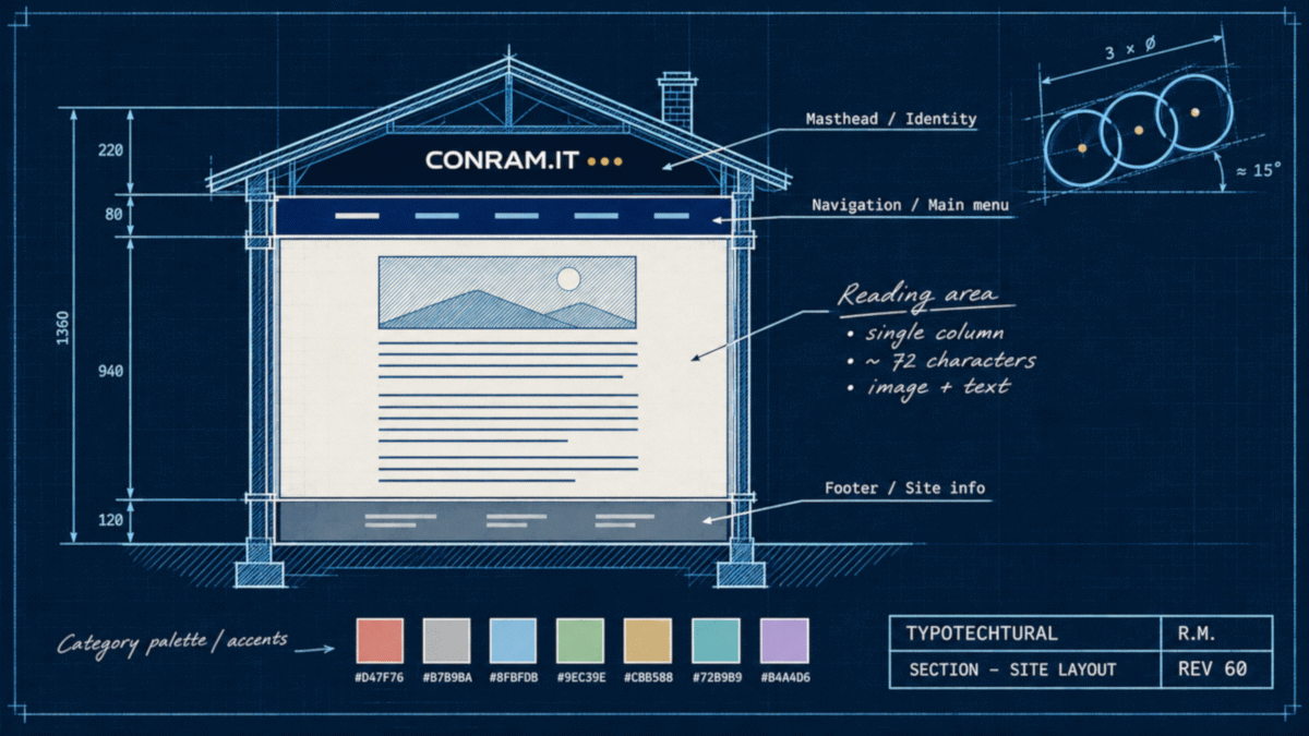
The new design sits on a dark background called Night, with light reading surfaces that lift the text off the page. The text column is held to around 72 characters per line. On a big monitor that can look stingy, but long lines are tiring, and a wall of text from edge to edge has never made anything easier to read.
Public Sans sets the body text, Exo the headings, and Geist Mono the menus, dates and small labels. The CONRAM.IT wordmark is an outlined Audiowide, which looks at home against the dark masthead.
The masthead itself is built around line drawings, one for each of the seven categories: a radar for Security, an audit motif for Compliance, a network for Internet, a process flow for ITSM, a staircase for Career, code meeting hardware for Tech and a controller for Gaming. Each category also has a colour. A Post's main tag decides its category, its colour and its masthead drawing, and any further tags simply mark it as relevant elsewhere. On the homepage the colours do most of the sorting for you; Pages are quieter, with plain reading surfaces and less decoration.
And Then Blue Came Back
Somewhere in the middle of all this the site drifted into an Ebony, Ivory and Gold look. It was handsome, possibly even elegant, and one evening I realised we had quietly dropped the colour CONRAM has been associated with for decades.
Blue.
The original CONRAM identity used a deep navy, #003466. That shade also has associations with Homeworld, and I wasn't going to give up that history because the design had wandered off in another direction. Blue came back, though not in place of the category colours. We split the job in two: category colours tell you what a Post is about, and blue tells you what you can interact with.
A sharper blue, #0070DC, now marks hover, keyboard focus and the page you're on. It's also the colour of my Orion's Belt Concept logo and its square sibling, which deserve their own story another day. The navy carries the menu and footer bands. Gold survived as the Career colour and the little dot in the wordmark. The square logo became the favicon, and the belt returned in the footer and in a few chosen places, which felt better than inventing a new symbol just because a redesign was under way.
Making Better Use of the Space
The homepage got a new card layout and a collapsible introduction under the menu, with a little background about the site and its author that folds away when you don't need it. Next to it sits a short strip of coloured bricks. They were inspired by a local municipality's design language, but drawn with our own geometry, since borrowing someone else's identity seemed like a poor start for a post about finding my own.
The Archive Page now lists every Post by year, with date, category, colour and excerpt, and the tag pages offer another way in. The pagination borrowed the large tiles used for moving between Posts. The menus kept the theme's own Superfish behaviour and got a more compact look, and they're still managed in Publii, so adding a menu entry doesn't mean hunting through JavaScript.
On wide monitors there was still empty space on either side of the text. Making the column wider would have undone the work on readability, so instead there's a faint background drawing: a blueprint grid, circuit traces and construction lines borrowed from the belt symbol. It fades out before it reaches the text, and if you never notice it, it has done its job. There's no animation and no parallax; it just keeps the margins from feeling abandoned.
The CV Problem
My CV Pages are long, long enough that scrolling back to the top to find a section gets old quickly. They now have a small, collapsible index that follows you down the page and stays out of the way until you open it. The Swedish CV was rebuilt from its Word master along the way: ten sections, 47 entries.
Then came the question of how to mark the sections, which took an entire evening I won't get back. We tried arrows, triangles, little CSS bricks, a runic divider and the medieval capitulum (⸿), the ancestor of the ¶ sign. That one was a genuine favourite until it turned out that not every computer has a font that can draw it. In the end I looked at the belt symbol, already sitting in the footer, and said the obvious thing: it's ours. It's drawn as a small SVG, so it looks the same everywhere, and it appears in front of the ten section headings only. On all 47 entries it would have been wallpaper.
The Code Behind the Appearance
By the start of November the customisation had grown to roughly 3,840 lines of CSS and JavaScript. That isn't alarming in itself. What worried me was how many places I'd have to touch when something needed to change.
Different parts had grown their own habits. The list of seven categories existed in nine places. Several scripts fetched and cached the same information independently, and others each worked out the site's home address on their own. Most of it worked, but every copy was one more thing that could quietly drift out of step when another part changed.
An architecture and compatibility audit mapped the overlaps, and on 3 and 4 November we cleaned up. The category list now lives in two places, one in JavaScript and one as CSS colour tokens. Five fetch-and-cache routines became one, six home-address lookups became one, and the scripts now share a common core instead of each carrying their own version of the same functions.
Before we started, we measured what could realistically go. The answer was about 12%, a good deal less than my first guess, and I found that oddly reassuring: most of the code had a reason to exist, it was just badly organised. New features have added code back since, and that's fine. Fewer places to change was always the point, not a smaller line count.
No clean-up step was accepted on looks alone. Each one was checked by comparing the computed style of every element, before and after, across 24 combinations of page types and screen widths. Apart from the changes we made on purpose, nothing moved. Real PDF print tests turned up a different kind of problem: the cookie banner could land on top of printed pages, and the masthead and menus wasted space on paper. Both were fixed without changing anything on screen.
A Few Artificial Colleagues
So who actually wrote all this code?
I've worked with computers and IT systems for decades, across infrastructure, administration, support, documentation and systems management. That's useful for deciding how a site should behave and for spotting when something has side effects nobody asked for. It doesn't make me a CSS expert. I can usually follow what a rule is meant to do, but somewhere around the twenty-third line of a sufficiently elaborate CSS construction I start to wonder whether I've wandered into a different programming language.
So much of Typotechtural was built with AI. Claude did most of the technical implementation, the source analysis, the consolidation and the testing. OpenAI's ChatGPT, which I've come to call Gepetto after the old Italian woodcarver, helped with design concepts, illustrations, architecture discussions and technical instructions, and ChatGPT's Work environment took on implementation tasks too. I decided what I wanted, weighed the alternatives, made the calls and pasted every piece of code and every setting into Publii myself. The assistants proposed, wrote, investigated and helped verify.
I have no interest in pretending I wrote thousands of lines of advanced CSS and JavaScript by hand. Nor was the site designed by a committee of assistants left to their own devices. The choices were mine, including the many suggestions I turned down.
Not Quite Vibe Coding
"Vibe coding" is the fashionable name for software made by prompting an AI and hoping for the best, and "AI slop" for whatever comes out the other end when nobody checks. I understand both terms. AI makes it very easy to produce something that looks convincing while being questionable underneath, and it's just as easy to mistake plausible for correct when you don't know where to look.
Typotechtural wasn't built that way. Every design change was sketched live in the browser and looked at before it went anywhere near the real code. Every version was archived, the important decisions were written down, and an independent audit produced fifteen findings that we worked through one by one. When the code started repeating itself, we consolidated it before adding anything new.
The testing went well beyond asking an assistant whether its latest change looked right: computed-style comparisons, reading the generated HTML, real PDF prints, and a full staging copy on the live server before anything replaced the old site. Not every problem could be closed before go-live, and one of them is described below. That one had been spotted in advance and was fixed within minutes.
I don't consider myself the author of every CSS declaration, and I don't need to be. I do consider myself responsible for knowing what the site should do, why each change was made and whether it works. Using AI to write code isn't the same as handing over responsibility for the result. To me, that's the distinction too many people skip.
Collaboration, With Occasional Complications
Working this way was productive, and at times it tested my patience. AI can produce working code remarkably fast, and it can also misread an instruction, forget a constraint we agreed on the day before, or build an elaborate solution to a problem nobody had actually identified. More than once a two-minute adjustment took an hour. On one memorable occasion a stylesheet lost about half its contents during an unrelated change. By then the project had a respectable collection of backups, which is the only reason that story is funny now.
The two assistants also turned out to suit different jobs. One was best at reading source code and generated output, the other at exploring visual ideas and talking through how the pieces should fit. Having both meant I could cross-check, although two AI systems agreeing with each other proves nothing about whether either is right. Someone still has to look, and the site still has to work.
None of that changed what I've believed throughout my career: tools make you faster, but they don't do your judging for you, and a technician isn't less responsible for the result because a clever tool did part of the work. What did change was where my time went. Instead of writing declarations, I spent it on requirements, on reviewing what came back, on catching side effects and on deciding which ideas deserved to survive. For someone with a long IT background and no burning wish to become a full-time CSS developer, that was a practical and genuinely interesting way to work.
And now and then, an excellent exercise in patience.
From Development to Production
Publii's local preview is good, but it isn't the server your visitors will reach. So the finished site first went up as a staging copy under conram.it/devwin/, where we could check everything on the real web server: the generated files, the menus, the Archive, the CV index, the sitemap, and the other projects that share the server and mustn't be disturbed.
At 21:46 on 4 November 2026, Typotechtural went live, a morning ahead of schedule.
The first check after the switch still showed the old site, which was briefly alarming, until a forced reload (Ctrl+F5) brought up the new one. Browsers like to hold on to stylesheets. Returning visitors may see the same thing for a day or so, until their browsers fetch the new files.
The second check found the one real problem, and it was one we'd seen coming. Three links in the homepage introduction used relative addresses, which work on most pages but point to the wrong place on tag pages and further pages of the listing, so the portrait and two links went missing there. The audit had flagged exactly this a few days earlier, but the fix couldn't go in before the move, because it would have broken the staging copy and the local preview, which both live in a sub-folder. It went in minutes after go-live, and a check across five page types found nothing broken. There's a difference between knowing about a defect and making sure it's gone, and that evening I got to see both.
Still the Same Website
I consider the redesign a success, but not finished. Page titles are bigger than they need to be next to their section headings, longer Posts deserve a contents index like the CV's, inline code needs better styling, and the remaining CVs and a few of the plainer site Pages want attention. That's ordinary upkeep, not second thoughts.
The part I'm most pleased with isn't a colour or a font. It's that the site finally looks like one design instead of years of accumulated changes, and that the things that made it conram.it survived the move: the blue, the belt and the subjects. It's still my notebook for technology, systems, processes and working life, plus the occasional Post that exists because something annoyed me enough that writing about it beat complaining. It isn't trying to compete with the big tech publications or to impress anyone with clever web tricks. It just needed a better home for what's already here, and room for whatever comes next.
Typotechtural wasn't about creating a different website. It was about giving an old one a better home.
And although the redesign benefited greatly from some very capable artificial colleagues, I remain reasonably confident that the next unreasonable idea will still be mine.